Flair's employee hub mobile app allows employees access their data that is managed by their HR through Salesforce
Note: This project was designed, implemented and released prior to flair's recent rebrand
Flair's Employee hub app allows employees to access their data that is managed by their HR through Salesforce.
When I joined Flair, I had the opportunity to redesign the end-to-end experience for our employee hub mobile app; our external application that allows employees in an organization to access their data that is managed by their HR through Salesforce.
The mobile app was built using React Native and I was the sole UX & Product designer for this project. My contribution was in Research, UX, Visual and Interaction Design and product management.
So, what was the problem?
After a UX audit, I gathered all the needed information to identify the drawbacks of the app's existing design. The core problem was that the app did not cover all of our user's (employees') basic needs to ensure a positive impact on employee productivity.
- It had very limited functions/features
- Core features were not prioritized based on employee's needs
- Lack of consistency in navigation and visual language
- Lack of aesthetics to complement app's usability
- Decreased retention
What we want to achieve
Our goal was to create a usable, consistent and intuitive experience with an appealing look. We aim to achieve this by:
- Ensuring simplicity and consistency in navigation and visual language
- Determining what core features to be prioritized based on our user's needs
- Providing a user feedback channel within the app for constant feedback
- Introducing a modern and stylish user interface
- Improving the functionality, loading time, and stability of the mobile app

The first version of the employee hub mobile app screens before the redesign (Click image to expand)
Research and Insights
As a young startup, and being fairly new to the HR tech industry myself, I put research at the forefront of my work in order to study the market scenery, gain domain knowledge, recognize opportunities, acknowledge threats, boost idea generation, and most importantly to support any design decisions I make throughout the UX process. While speaking with about 5 of our second level customers (employees), I tried to identify their needs and pain points in order to create a more professional, up-to-date, and usable application that employees would be excited about.
I was able to gather some insights and data that provided me with a good starting point and I came up with potential implementation use cases (similar to user scenarios) and specific processes that should be carried out by different parts of the app.
.svg)
SWOT Analysis
From the business angle, I wanted to understand where we (Flair) stand as an HR Tech company and researched on a couple factors that positively influence the development and growth of our product (strengths and opportunities), and the ones that have a negative impact (weaknesses and threats). I drew out a SWOT analysis showing our strengths and weaknesses as features of the current state of our product/business, and opportunities and threats as expected future phenomena.

Competitor Feature Analysis
In order to know how receptive the market is to our business and what works or does not work, It was important for me to understand how similar businesses are functioning. I analyzed a few of our competitors/key players in the HR tech industry who also offer a mobile app for their employees similar to our employee hub app. By doing this and sharing my findings with the team (as well as other stakeholders) we were able to determine what was considered as standard practices, identified competitors with leading approaches, and leverage on gaps that can help improve our product and differentiate ourselves from them.

(Click image to expand)
Design Approach
It was important for me to ensure that I followed standard design principles and make sure that the experience I create was one that offers flexibility, support, and guidance for employees and not dictating their experience.
.svg)
Keeping the experience simple and consistent
While it’s very important for us as a team to understand our research findings, it was even more important for me as the project lead and the UX designer to know what actions to take based on that understanding. I wanted to design all parts of the experience to be as contextual as possible, and that means If it's not absolutely necessary to show something at a given moment, we would not show it.

(Click image to expand)

(Click image to expand)
What core features was prioritized
To personalize the employees' experience, and give them insights into what is happening in their organization, I introduced a 'Homescreen' for the landing page. I added the 'Absences' feature that wasn't present in the previous design, and added a flow that allowed employees to be able to upload their documents which previously could only be done on the web app of the Employee hub. The 'documents' feature was merged with the 'My data', and I also made improvements on the 'Time Tracking' feature that already existed on the app.
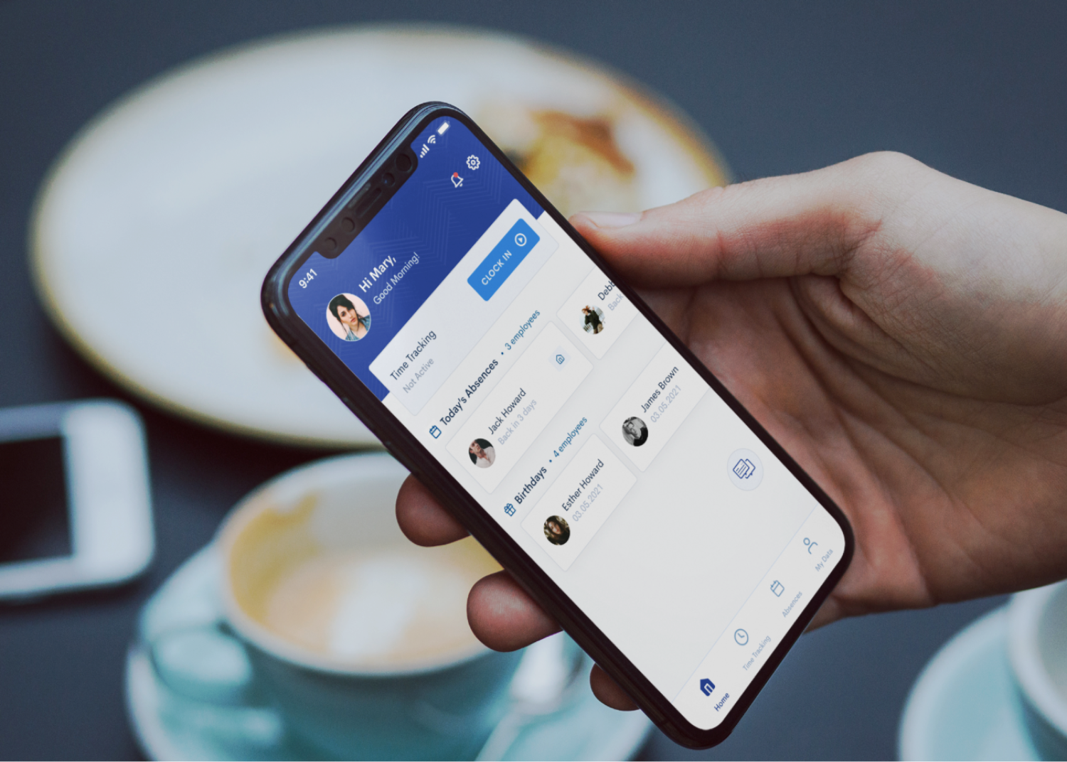
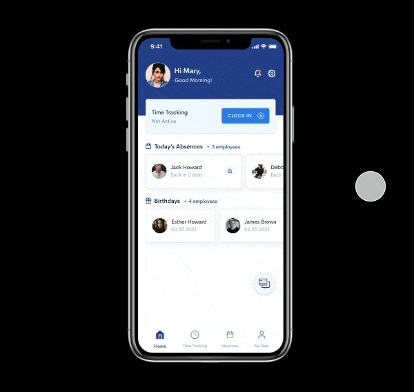
A New Homescreen
The homescreen shows a personalised welcome message and an overview of what's happening in their organization.
Clock in: I found that proximity tended to matter more with our employees because they strongly preferred to jump right into what they needed once they opened up the app. So, I included the time tracking panel into the home screen so employees can start their day by clocking in.
Birthdays & Absences: Employees can see who is absent for the day and which colleague have upcoming birthdays.
Feedback Channel: I added a feedback channel on the home screen to get us direct feedback from employees and ensure that future iterations are data-driven and come from a deep understanding of our users and their needs.


Improvements to "Time tracking"
The time tracking feature that previously existed on the app only allowed for just tracking time and viewing your timesheet for the current week. In the redesign, I wanted to add more functionality to enable employees engage more on the app and on the go.
Editing Time Entries: Asides from tracking their time, employees are able to edit their time entries and submit them to their line managers with a status to let them know when their requests are pending, approved, or declined.
Visibility of Hours: Employees can view in more detail the number of hours tracked for the day, how many hours are remaining to complete their workload, and any possible overtime hours.
Timesheets View: Employees will be able to view their timesheets for any week in the current year.


The New 'Absences' Feature
One of the major pain points was the inability to request absences directly on the mobile app. Requesting absences are standard practice in employee apps, with most (if not all) employees having vacation days and some kind of absence types, so it was very important to allow employees easily request absences directly from the mobile app.
'Absences' was split into 2 slider tabs; the overview and history tabs.
Overview: The overview tab shows employees’ upcoming absences, access to easily request for an absence, absence types available to them, and their balances.
Absence History: The history tab documents all absences requested showing absence the number of days requested, time period, and its status.


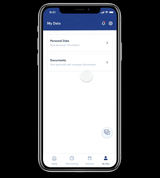
The new 'My Data' feature
'My Data' is split into 2 sections; personal data and documents. Personal data shows employees’ personal information with edit functions, while ‘Documents’ shows employees’ personal and company documents.
Personal Data: This comprises the employees’ personal details. They can easily edit and making changes to their personal information in the mobile app. I added a status view, so employees are aware when their data changes are pending or approved.
Documents: We made a few changes by spliting the 'documents' screen into 2 slider tabs; Personal and Corporate. The personal tab shows employees’ uploaded documents. The Corporate tab on the other hand shows all company documents uploaded to their employee account by their HR.
Uploads: I also introduced a new function within 'documents' that allows employees to upload personal documents for review like doctor's reports, receipts for expense claims, and so on.

Merging the 'Documents' feature into 'My Data'
Before the redesign, 'documents' was a stand-alone feature, where employees could only view all their company documents. After a task-based test experiment with our users, we observed that 90% of them instinctively navigated to 'My data' to view their documents. Based on this experiment, we decided to merge the 'documents' feature into the existing 'My data' feature which details all of the employee's personal and company information.


Testing
I invited 6 "eligible" co-workers (outside of the product and engineering team) for user testing using a prototype our mobile developer built, as well as a select few employees from some of our customers. I drafted the testing script. Everyone was able to get through the tasks of:
1. Tracking time from the home screen
2. Editing their time entries
3. Submitting an absence request
4. Navigating to 'documents'
4. Uploading a document from their device
We also asked for feelings about the new mobile app in general. The most indicative response was that "The app is much more useful to me as an employee".
Outcomes
MVP requirements and design were completed within the space of 4 months. There was a huge improvement in retention, more users used the mobile app as opposed to the web app. Real user feedback was generally positive with most indicating that the redesign of the app was easy to use and was enjoyable. However, A few indicated that they would have preferred having 'shifts' as a core feature rather than 'absences' as the latter is used occasionally while the former is used more often.
Based on the findings from both UX Research and validation sessions, we were able to come up with a list of minor changes that were addressed and updated in the prototype. An example is that we realised that the feedback channel button that shows on every screen was an annoying interference for the users, especially on screens where they needed to perform certain functions. So we removed the button and placed them only on the landing pages of each menu.
Plans for next iteration include:
- A feature for employees to view their assigned shifts
- Notifications and manager approvals
- Uploading Avatars
Retrospective
I was responsible for leading the project and the sole UX designer. Being a small remote team, I took on more PM responsibilities due to the circumstances and continue to manage the mobile project and plan for future iterations. As a newcomer to the HR tech industry, working on this project has given me the opportunity to learn more on the HR tech startup environment and how technology has revolutionized the human resources industry.


.png)
.png)