Designing a Personalized Employee Portal for Focus and Flexibility
I redesigned flair's cluttered and impersonal employee hub dashboard into a flexible, insight-driven space that employees could customize to their needs.
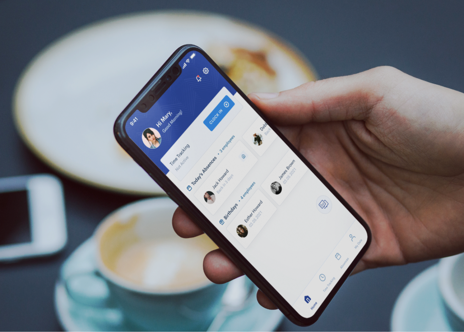
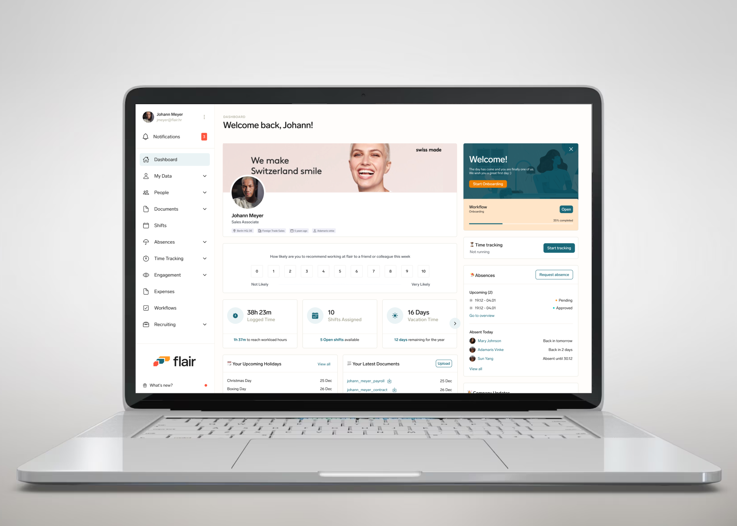
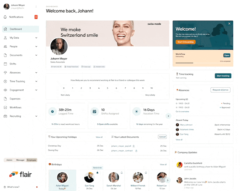
The redesigned employee hub home dashboard
Flair's Employee hub app allows employees to access their data that is managed by their HR through Salesforce.
I had the opportunity to redesign the dashboard for our employee hub web app; our external application that allows employees in an organization to access their data that is managed by their HR through Salesforce. I was the sole UX & Product designer for this project. My contribution was in Research, UX, Visual and Interaction Design.
Team
Kikelomo Blavo (Me) UX Designer
Gary Yagutan- Software Engineer
Tools
Figma, Illustrator, Notion, Linear
Release Date
March 2023
What was the problem
The existing dashboard suffered from a number of usability issues that make it difficult to use and interpret. These issues include:
Overcrowded design: The dashboard is cluttered with too much unimportant information and table view.
Limited information: The dashboard focused more on unimportant data. Employees had no insights into their most important data.
Inflexible layout: Employees had to navigate multiple screens to access different resources, which was time-consuming and frustrating.
Responsiveness: The dashboard did not work well on different screen sizes and devices.
What we want to achieve
To address these issues, we proposed a redesign of the employeedashboard that focused on improving usability. The key features of the redesign include::
Personalised and Simplified Layout: The new design should remove unnecessary information and present data in a clear and concise manner.
Clear hierarchy: By default, the most important data is presented first, with less important data grouped together in a separate section.
Customizable layout: Users should be able to customize the layout of the dashboard to suit their needs, allowing them to prioritize the data that is most important to them.
Responsiveness: Create a responsive and mobile friendly version of the dashboard
What was the problem
The existing dashboard suffered from a number of usability issues that make it difficult to use and interpret. These issues include:
Overcrowded design: The dashboard is cluttered with too much unimportant information and table view.
Limited information: The dashboard focused more on unimportant data. Employees had no insights into their most important data.
Inflexible layout: Employees had to navigate multiple screens to access different resources, which was time-consuming and frustrating.
Responsiveness: The dashboard did not work well on different screen sizes and devices.
The employee hub dashboard before the redesign.
What we want to achieve
To address these issues, we proposed a redesign of the employee dashboard that focused on improving usability. The key features of the redesign include:
Personalised and Simplified Layout: The new design should remove unnecessary information and present data in a clear and concise manner.
Clear hierarchy: By default, the most important data is presented first, with less important data grouped together in a separate section.
Customizable layout: Users should be able to customize the layout of the dashboard to suit their needs, allowing them to prioritize the data that is most important to them.
Responsiveness: Create a responsive and mobile friendly version of the dashboard
The employee hub home dashboard was cluttered with unnecessary information, imagery was taking up too much space, and it showed no insights for the employee
Design Approach - Keeping the experience simple.
It was important for me to ensure that I followed standard design principles and make sure that the experience I create was one that offers flexibility, support, and guidance for employees and not dictating their experience. I wanted to design all parts of the dashboard to be simplified and as contextual as possible, and that means If it's not absolutely necessary to show something at a given moment, we would not show it.
A rough draft for the proposed redesign of the home dashboard to ensure that approach was simple and insightful
Creating a Personalised Layout
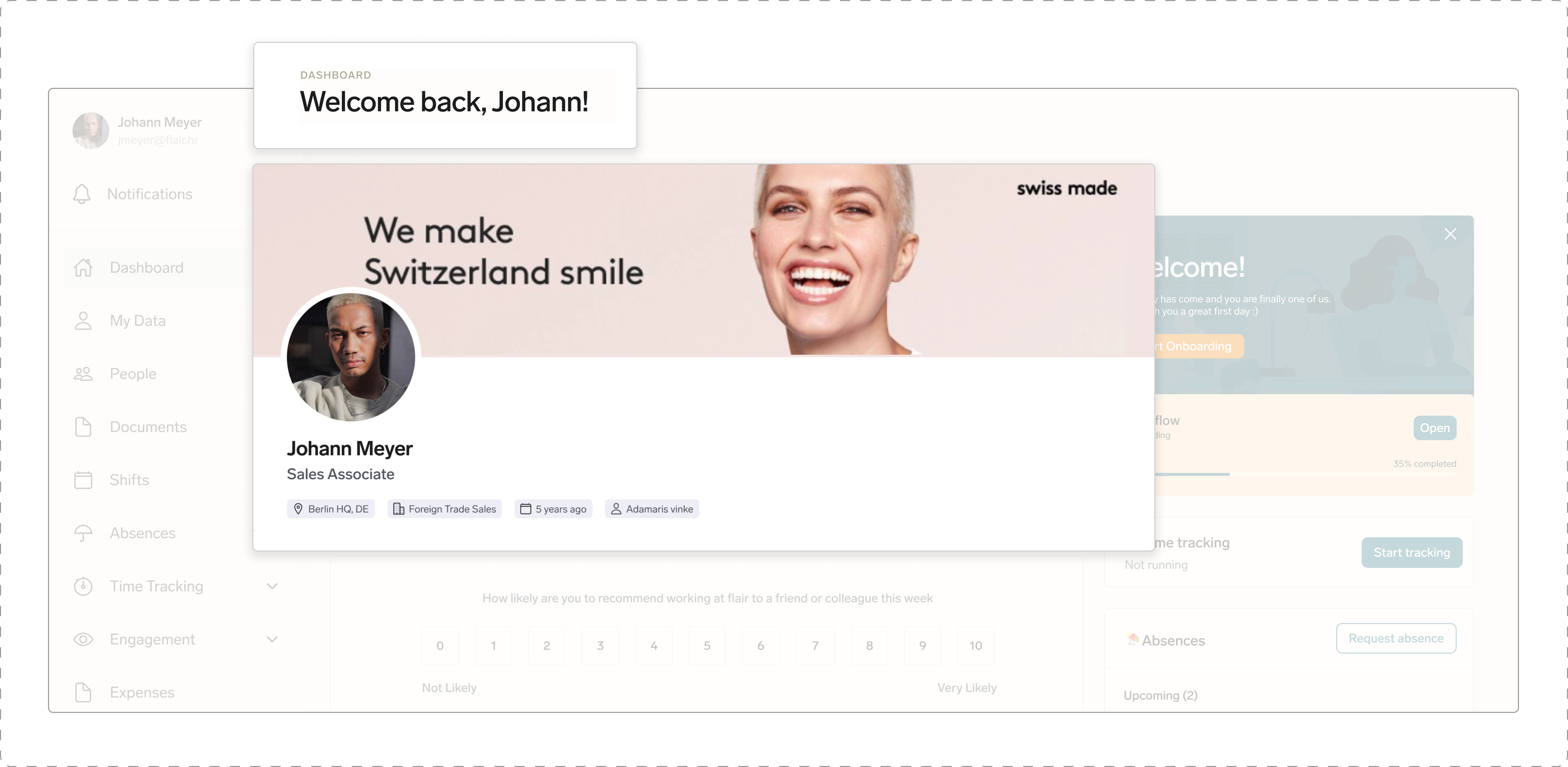
Personalising the dashboard can help to create a more engaging experience for the user. I wanted the dashboard feel more welcoming and friendly by addressing them across the application with their first names. We also made changes to our banner, before the redesign there was a generic banner illustration displayed, and this applied to all companies using the hub, and so aligning with our mission of personalising their experience, we created the option for HRs to upload a banner image that reflects the company. This will also give employees the feeling of "coming in to work" when they see a banner image relating to the company they work for.
Including a personalised message with the user's first name and Introducing a company backdrop banner will give employees the feeling of "coming to work" and will help create a more engaging experience for them
HR Managers or Company Admins can upload a suitable banner image from their salesforce backend. Once the image has been uploaded and saved, the image will reflect across all the employee hub accounts of their employees.
The process of uploading a company banner image from the salesforce backend. This image will then appear across all employee's accounts
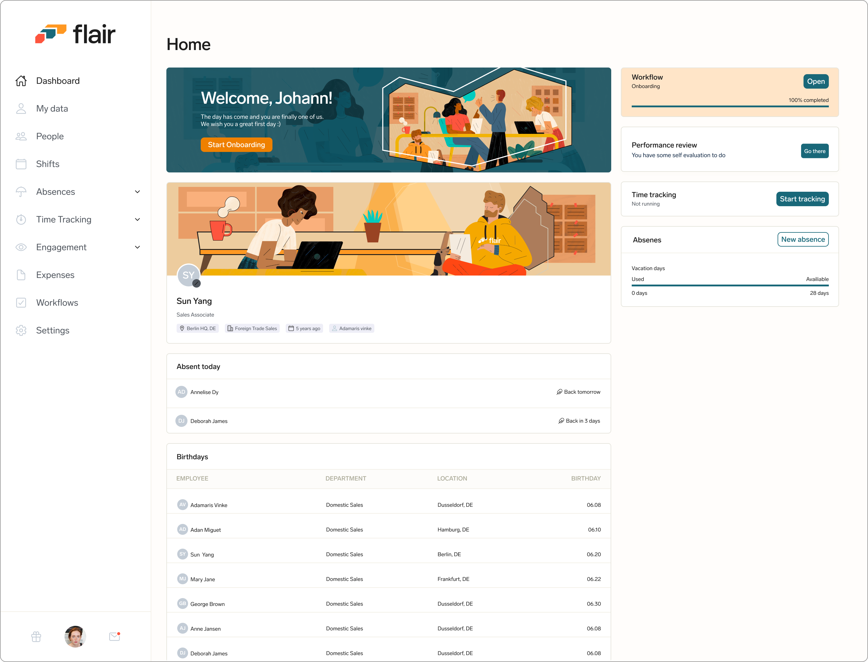
Showing a Clear Hierachy
Users want to see insights that are most important to them, so I needed to design the dashboard to show a clear hierarchy of information by showing the most important data presented first, with less important data grouped together in a separate section below.
Less important data such as co-worker birthdays and company updates are grouped in a separate section and are placed below the more important employee data.
Customizable Data Overview
I designed the layout to be flexible so users can customize the overview section of their dashboard depending on what information they want to see. This allows them to prioritise the data that is most important to them.
Employees can choose what data they want to see on the overview section of the dashboard
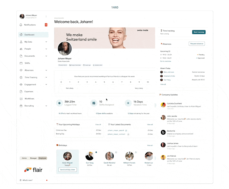
Responsiveness
I designed the homepage dashboard to be responsive so it works well on different screen sizes and devices. Even though we already had a mobile app, I designed the dashboard to be mobile friendly, so our users can easily access, interact with, and modify visualizations on a smaller screen.
The dashboard view across different devices/screen sizes
Outcome
Requirements, design and implementation were completed within the space of 3 months. As typical, we use our product so I did some internal testing with some members of the flair team (outside of product and engineering) to validate the design and ensure it was intuitive enough before implementation.
Unfortunately, I wasn't able to get any feedback for this project as my time at flair ended shortly after it's MVP release. Below is a product release video for the project.

.png)

.png)
.png)
.png)