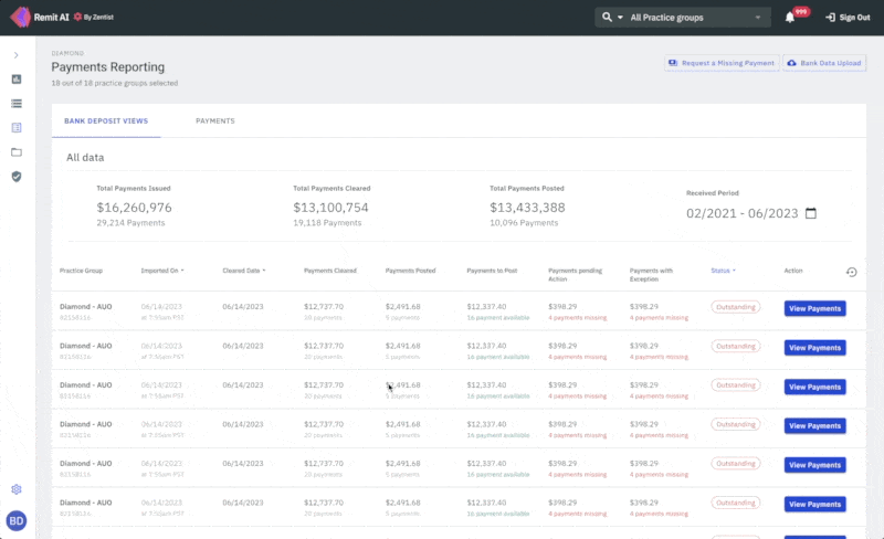
The redesigned payments reporting page
Information on this project is limited.
Zentist's Remit AI web app centralizes EOBs and ERA data from across 700+ insurance payers for faster payment posting and ease of reconciliation.
I had the opportunity to redesign the payments reporting feature for our Remit AI web application.
Remit AI leverages robotic process automation (RPA) and machine learning to place otherwise tedious RCM tasks, such as insurance payment posting, on autopilot, thereby freeing up employee time for elevating the patient experience.
The Payments Reporting feature helps to simplify reporting for bookkeeping and reconciliation for our users.
I was the sole UX & Product designer for this project. My contribution was in Research, UX, Visual and Interaction Design.
Team
Kikelomo Blavo (Me) UX & Product Designer
Artur Sianiuk - Software Engineer
Albert Gafiatullin - Software Engineer
Tools
Figma, Illustrator, Notion, Linear
Release Date
August 2023
What was the problem
The existing payments reporting page suffered from a number of usability issues that make it difficult for our users to use and interpret. These issues include:
- Confusing Information Architecture: User could not differentiate between single payments and bank deposit bulk payments which made it confusing
- Inflexible Layout: The payments reporting page was cluttered with the information displayed with no breathing space.
- Navigation Problems: Users had problems navigating from one payment to the other
What we want to achieve
To address these issues, we proposed a redesign of the payments reporting page that focused on improving usability. The key features of the redesign include:
- Clear Information Architecture: By default, the most important data should be presented first, and users should be able to differentiate between single payments and bulk Bank deposit payments
- Simplified Layout: The new design should remove unnecessary information, utilise space and present payments reporting data in a clear and concise manner.
- Clear Navigation: Users should be able to navigate through the page without getting lost or confused.
What was the problem
The existing dashboard suffered from a number of usability issues that make it difficult to use and interpret. These issues include:
- Overcrowded design: The dashboard is cluttered with too much unimportant information and table view.
- Limited information: The dashboard focused more on unimportant data. Employees had no insights into their most important data.
- Inflexible layout: Employees had to navigate multiple screens to access different resources, which was time-consuming and frustrating.
- Responsiveness: The dashboard did not work well on different screen sizes and devices.
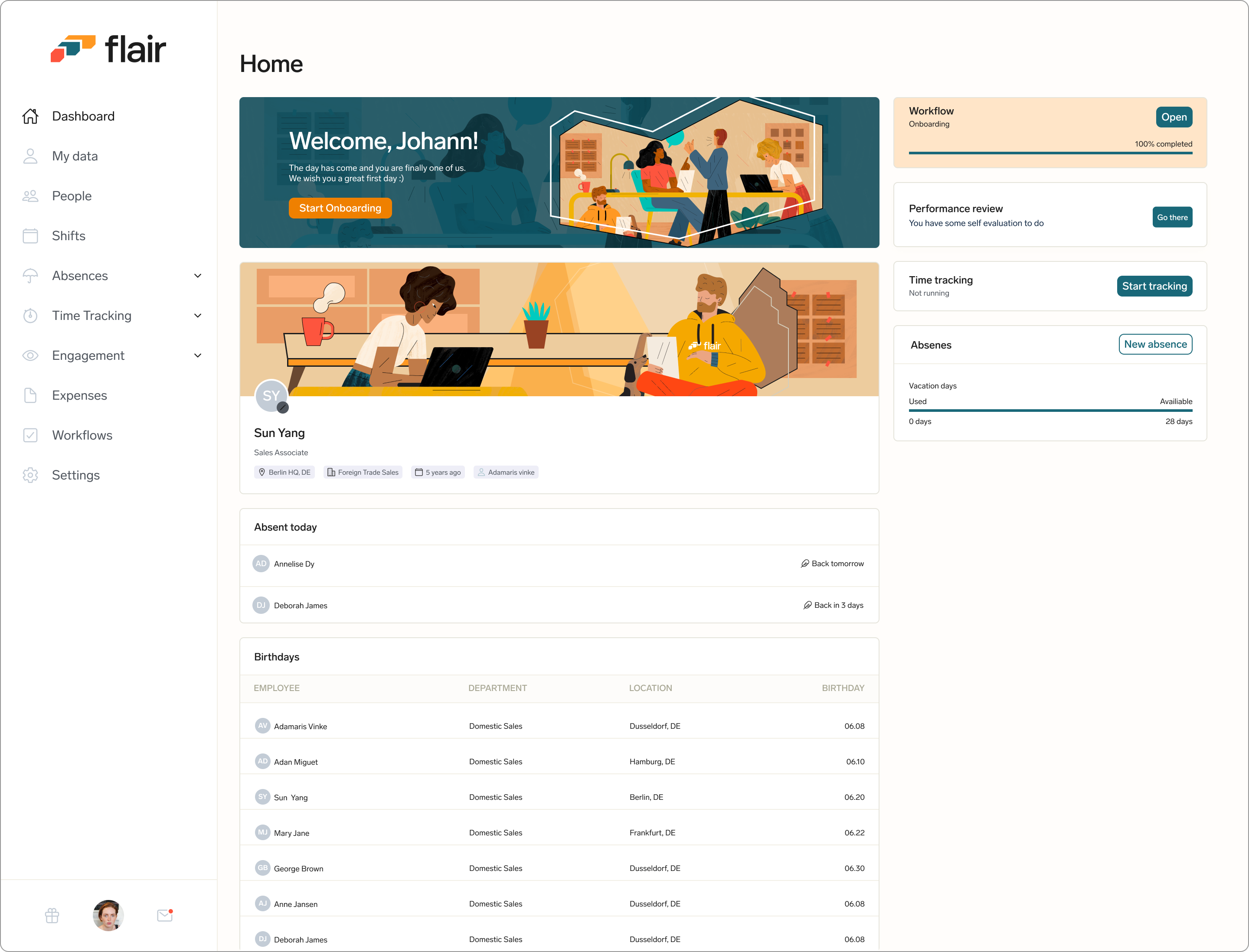
The employee hub dashboard before the redesign.
What we want to achieve
To address these issues, we proposed a redesign of the employee dashboard that focused on improving usability. The key features of the redesign include:
- Personalised and Simplified Layout: The new design should remove unnecessary information and present data in a clear and concise manner.
- Clear hierarchy: By default, the most important data is presented first, with less important data grouped together in a separate section.
- Customizable layout: Users should be able to customize the layout of the dashboard to suit their needs, allowing them to prioritize the data that is most important to them.
- Responsiveness: Create a responsive and mobile friendly version of the dashboard
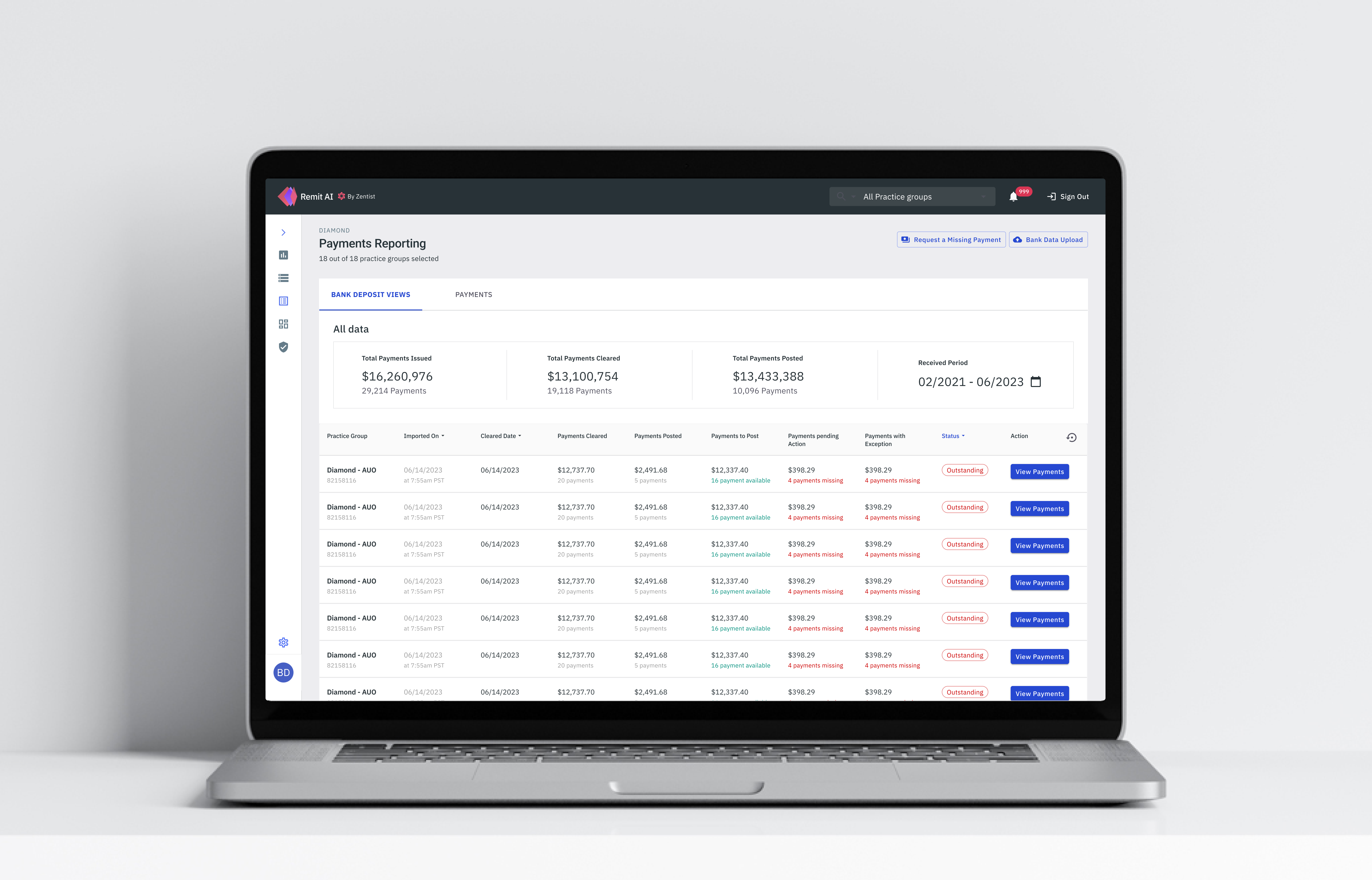
The payments reporting page was cluttered with the information displayed with no breathing space. Our Users had problems navigating from one payment to the other due to Bank Deposit and single payments all in page and it's inflexible layout
Clear Information Architecture
My design approach was to keep the design simple. It was important for me to ensure that I followed standard design principles and make sure that the experience I create was one that offers flexibility, support, and guidance for our users and not dictating their experience. I wanted to design all parts of the payments reporting feature to be simplified and as contextual as possible, and that means If it's not absolutely necessary to show something at a given moment, we would not show it.
A rough draft for the proposed redesign of the payments reporting page to ensure that approach was simple and insightful
Simplified Layout
Simplifying the page layout will help give more clarity for the user. I wanted the payments reporting page to not only be simple but also feel very user friendly for the user.
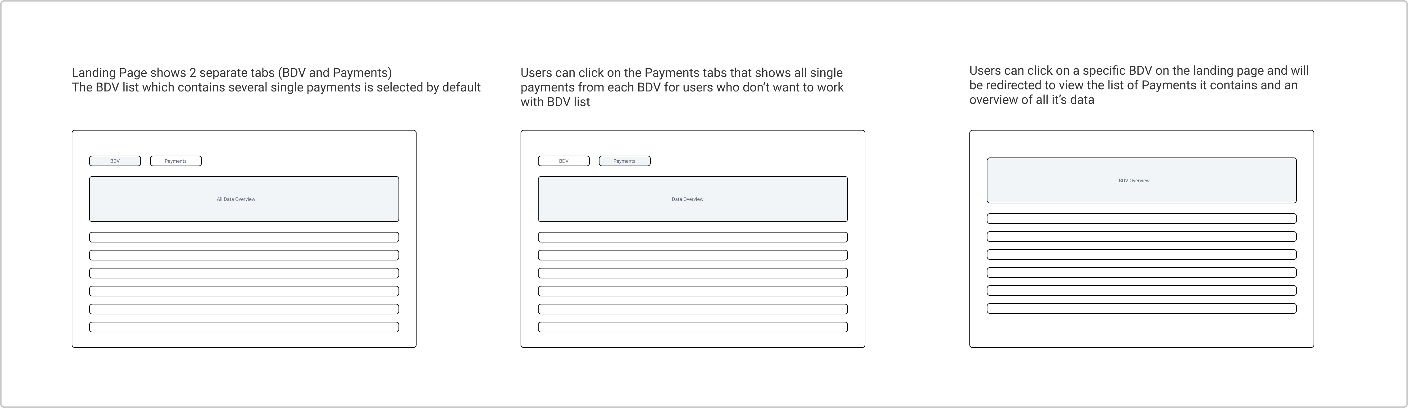
I introduced 2 separate tab views that shows all bank deposit pulled into the system and a list of single payments regardless of their associated BDV. With these separate, our users can can enjoy more flexibility by choosing which section they want to focus on to help efficiently increase the visibility of their payments
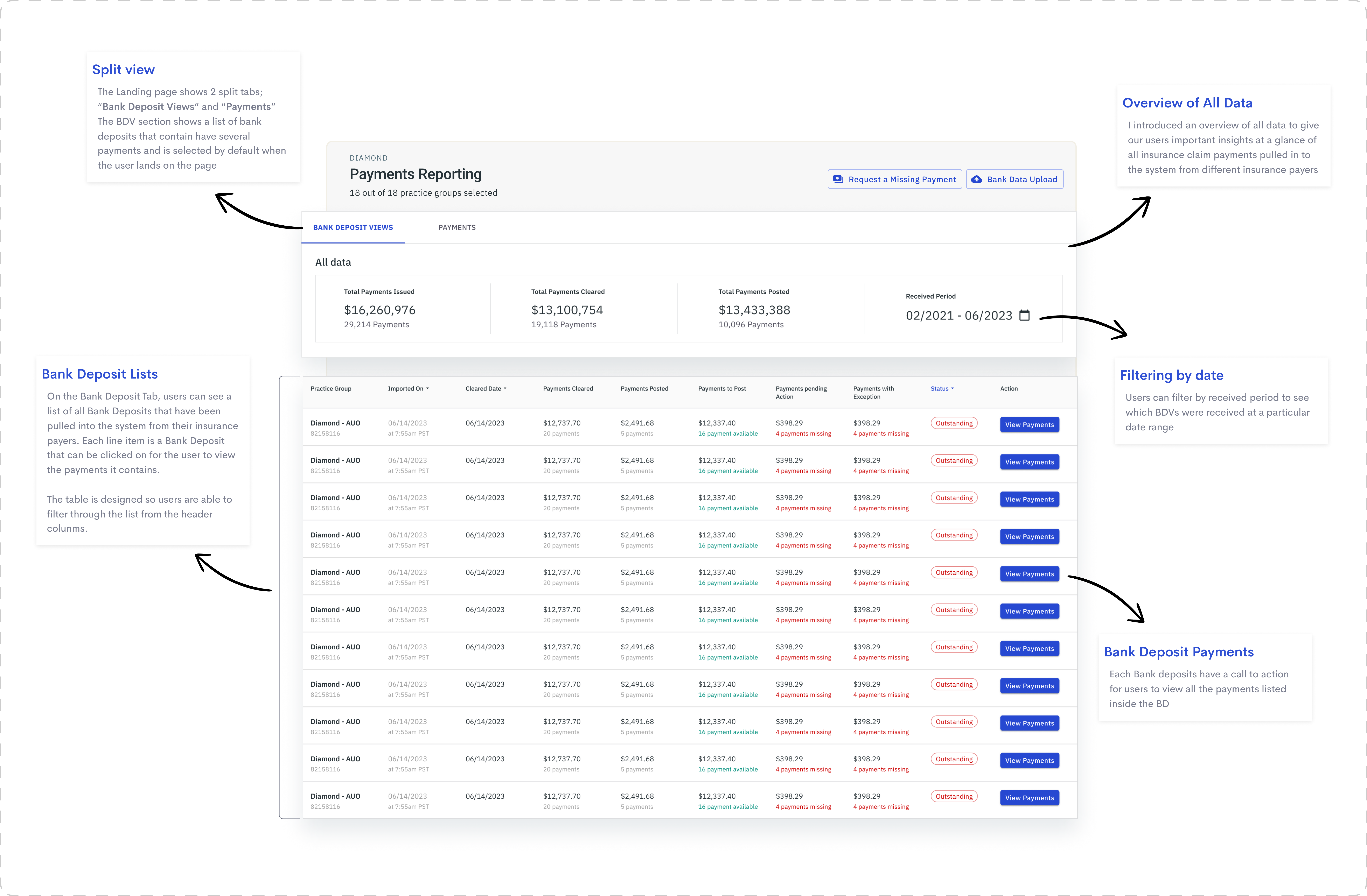
The Landing page shows 2 split tabs; “Bank Deposit Views” and “Payments”The BDV section shows a list of bank deposits that contain have several payments and is selected by default when the user lands on the page
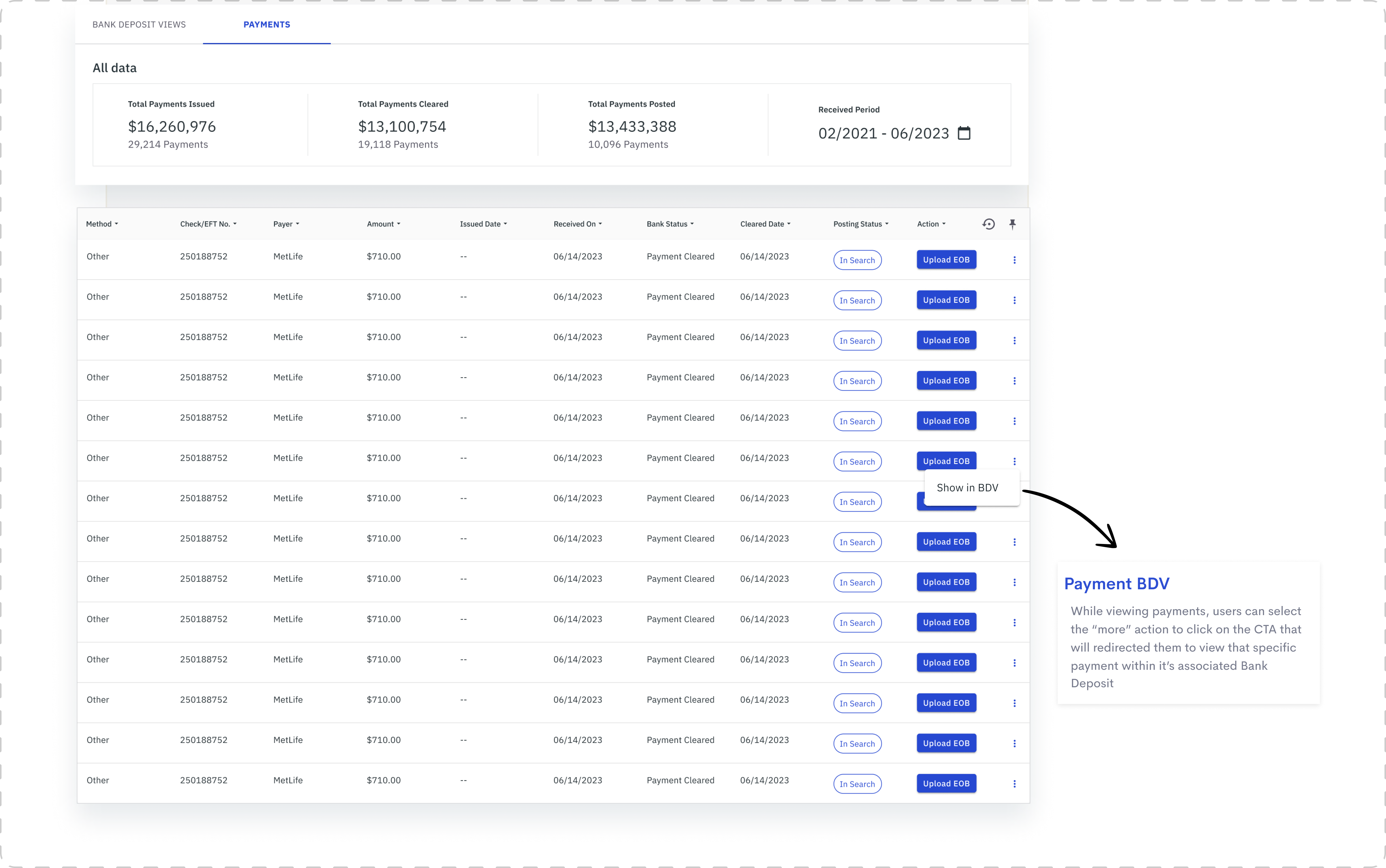
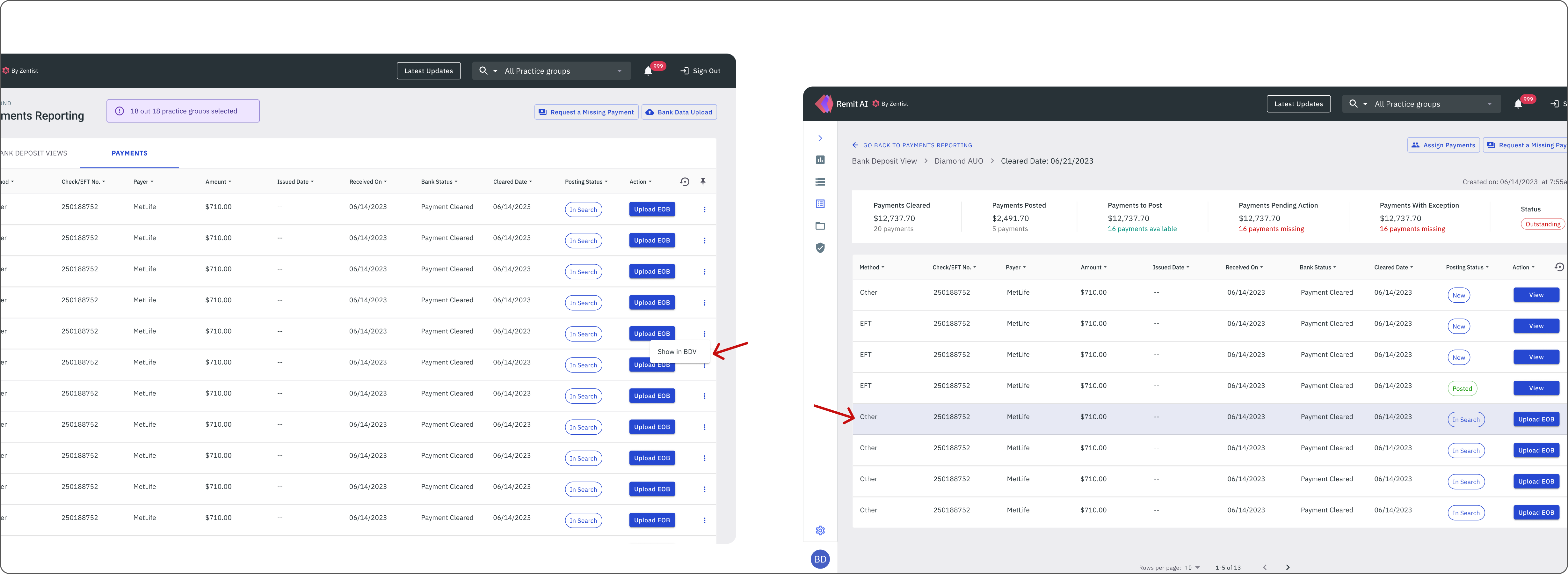
The Payments tab shows the same layout as the Bank Deposit view, to ensure consistency across the payments reporting feature. Users can only see a list of single payments as line items regardless of their associated Bank deposit. There is also the option for the user to navigate to the bank deposit view where the payment originated from.
The payments section follows the same layout as the bank deposit tab, but users can see all single payments as well as navigate to see which BDV it is associated with
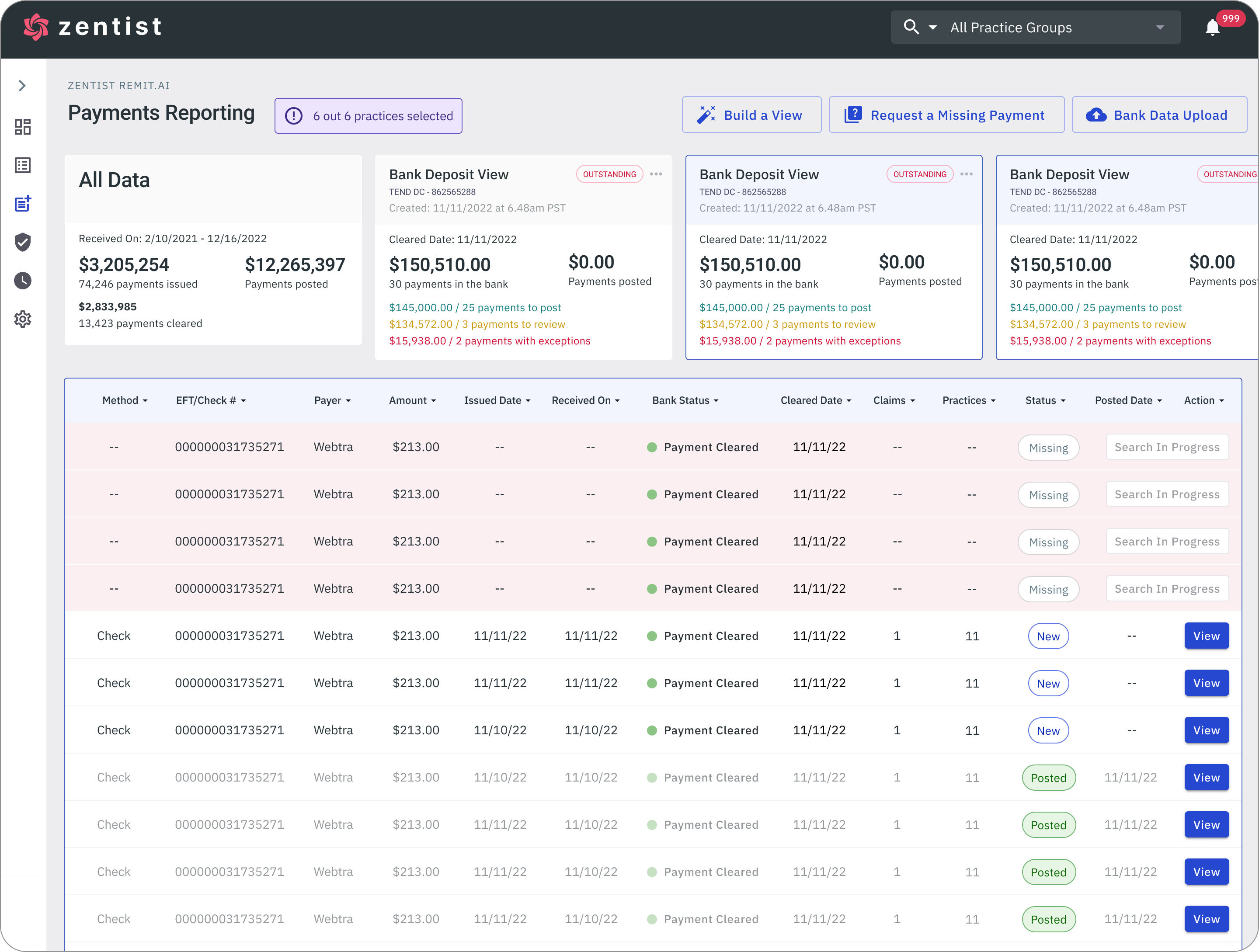
When the user clicks a specific Bank Deposit to view payments, they will be redirected to a separate screen that shows all the information associated with that Bank Deposit as well as it's list of payments.
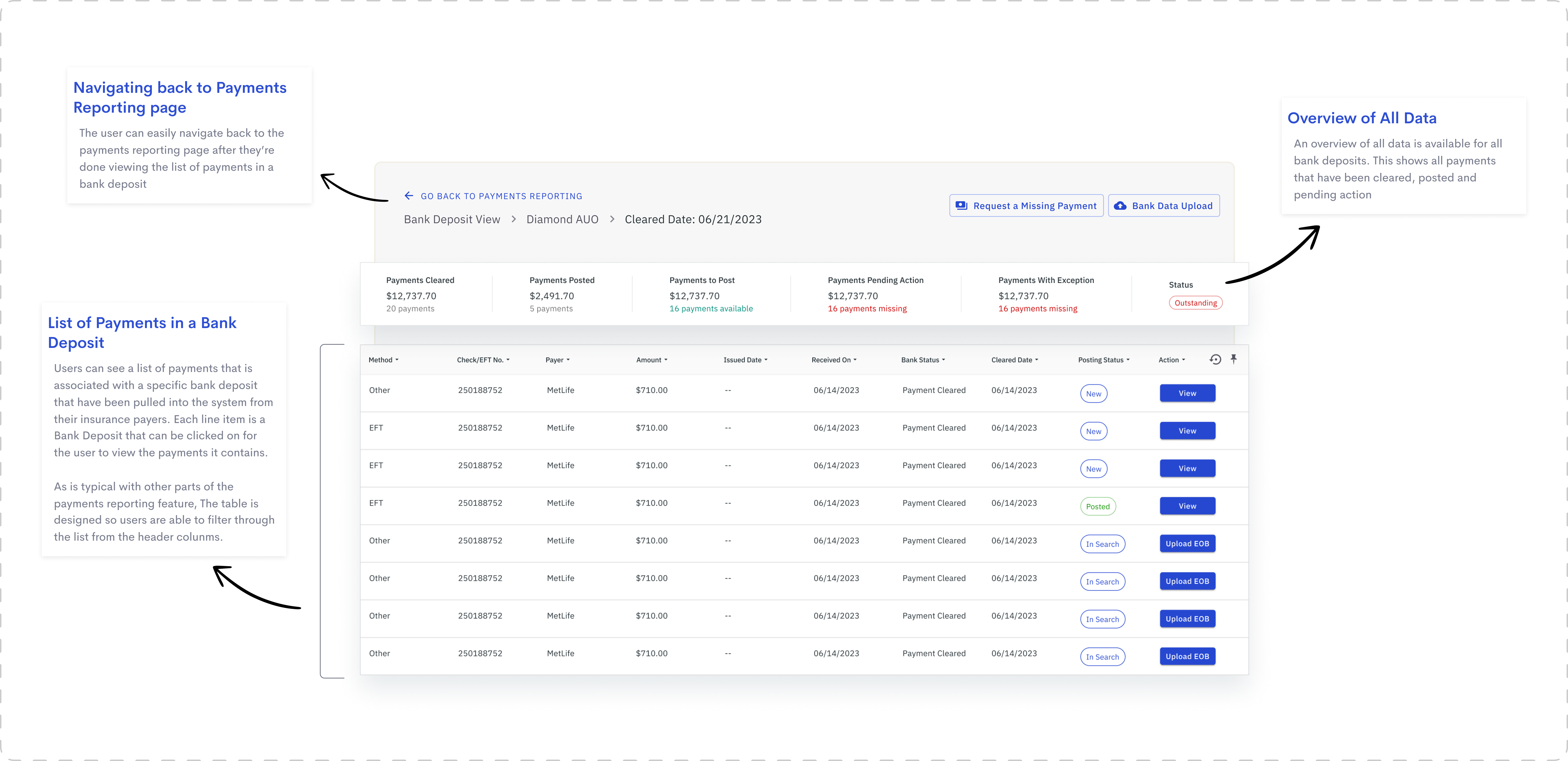
A view of the payments list and all information associated with a specific BDV
When a user redirects to the bank deposit view from the payments list on the landing page, that specific payment will be highlighted on the list.
A view of the payments list and all information associated with a specific BDV
Clear Navigation
I ensured that the navigation was clear enough to guide users through the interface, helping them achieve their goals, whether it's to find information, complete a transaction, or achieving a specific task. It was necessary to design it in a way that it aligns with our user's desired outcomes. Please click image below to view high resolution prototype
Navigation was clear enough to guide users through the interface (Click to view prototype)
Outcome
Design and implementation were completed within the space of 3 months and adoption was quick and feedback was generally positive and enthusiastic. It was clearly a much needed solution that help increase our client's engagement with the app. The Redesign was released in August 2023.

.png)