The redesigned Baki web application
Information on this project is limited.
Canza Finance is an open finance portal enabling access to unlimited financial services for emerging markets.
I had the opportunity to redesign the first version of the
Baki web application, which is one of Canza's flagship product.
Baki is an infinite-liquidity FX exchange offering users access to synthetic on-chain assets, called zTokens, that are pegged to African currencies. Baki will be the first on-chain implementation of African stable coins. Baki is designed to mitigate scarcity of dollars in emerging markets, whilst offering access to dollar markets with no slippage and at the most competitive rates available on the market.
I was the sole UX & Product designer for this project. My contribution was in
Research, UX, Visual and Interaction Design.Team
Kikelomo Blavo (Me) UX & Product Designer
Deon Achuo - Software Engineer
Robert Di Veroli - Product Management
Tools
Figma, Illustrator, Notion, Linear
Release Date
August 2023
What was the problem
The existing baki web app suffered from a number of usability issues that make it difficult for our users to use and interpret. These issues include:
- No clear guidance on how to connect to the app
- Lack of consistency in navigation and design language.
- Lack of aesthetics to complement the apps usability
- No clear hierachy in visual layout
What we want to achieve
To address these issues, I proposed a redesign of the baki web app that focused on improving usability. The key features of the redesign include:
- Clear guidance on how to connect to the app
- Simplicity and consistency in navigation and visual language
- Introducing a modern and stylish interface
- Clear visual hierarchy
What was the problem
The existing dashboard suffered from a number of usability issues that make it difficult to use and interpret. These issues include:
- Overcrowded design: The dashboard is cluttered with too much unimportant information and table view.
- Limited information: The dashboard focused more on unimportant data. Employees had no insights into their most important data.
- Inflexible layout: Employees had to navigate multiple screens to access different resources, which was time-consuming and frustrating.
- Responsiveness: The dashboard did not work well on different screen sizes and devices.
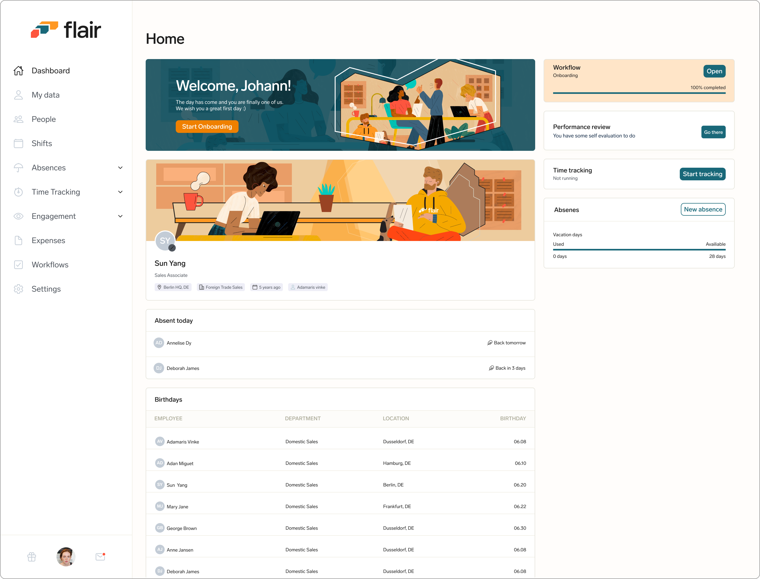
The employee hub dashboard before the redesign.
What we want to achieve
To address these issues, we proposed a redesign of the employee dashboard that focused on improving usability. The key features of the redesign include:
- Personalised and Simplified Layout: The new design should remove unnecessary information and present data in a clear and concise manner.
- Clear hierarchy: By default, the most important data is presented first, with less important data grouped together in a separate section.
- Customizable layout: Users should be able to customize the layout of the dashboard to suit their needs, allowing them to prioritize the data that is most important to them.
- Responsiveness: Create a responsive and mobile friendly version of the dashboard
The baki web app before the redesign had an, a confusing flow and was not aesthetically appealing
Design Approach - Keeping the experience simple.
It was important for me to ensure that I followed standard design principles and make sure that the experience I create was one that offers flexibility, support, and guidance for our users and not dictating their experience. I wanted to design all parts of the baki web app to be simplified and as contextual as possible, and that means If it's not absolutely necessary to show something at a given moment, we would not show it.
A rough draft for the proposed visual layout to ensure that approach was simple and insightful
Visual Language
I established a basic style guide as a crucial step in my redesign efforts. The primary purpose of this style guide was to provide me with a framework and reference point to maintain consistency throughout the platform's redesign.
Most importantly, It helps to lay the groundwork for its evolution into a comprehensive design system in the future. This means that as the platform continues to grow and evolve, the style guide can be expanded into a full-fledged design system, ensuring that our design principles remain scalable, adaptable, and consistently applied across all facets of the user experience.
I created a basic style guide to provide me with a framework and reference point to maintain consistency throughout the platform's redesign
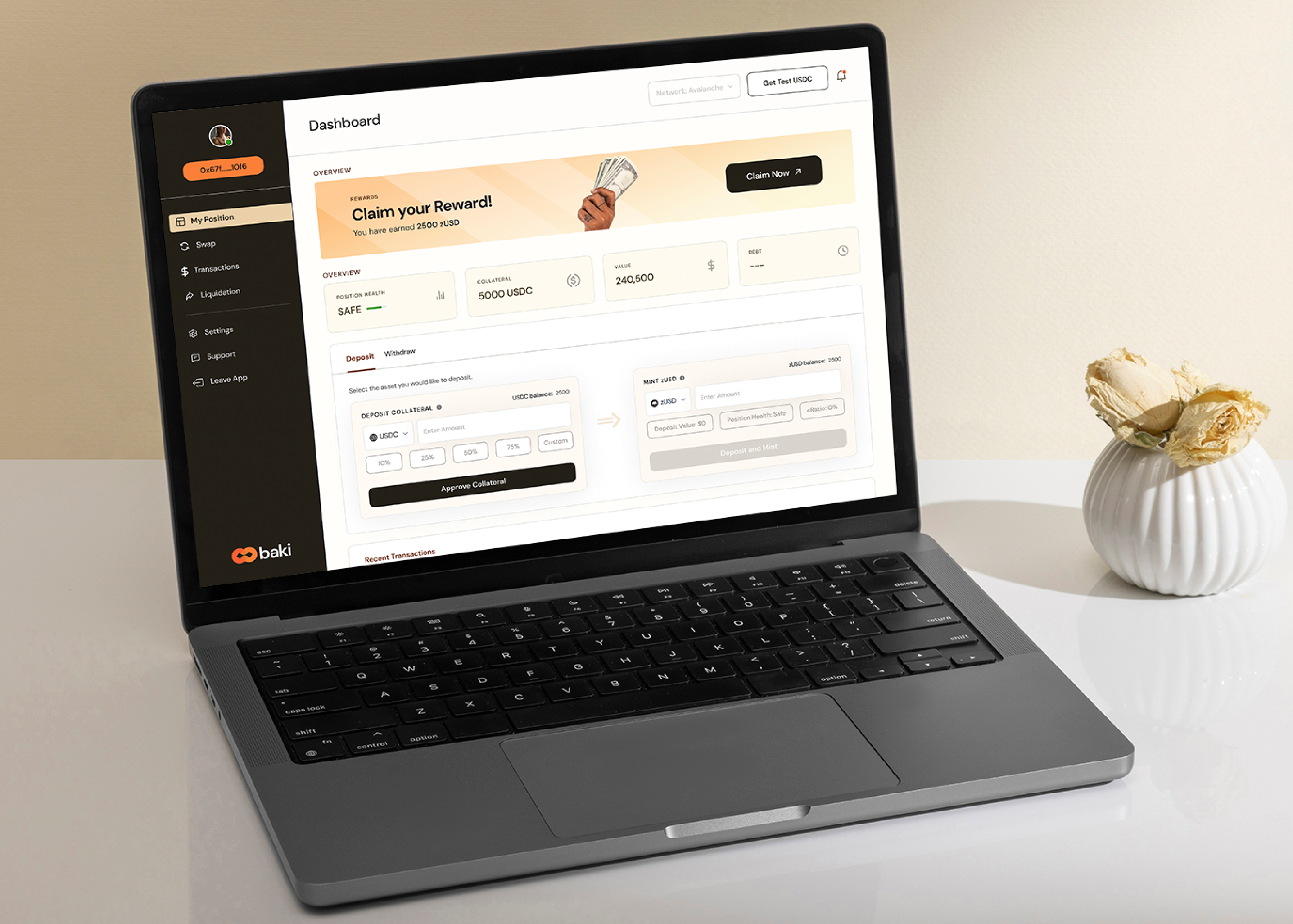
Guiding Users on Getting Started
The Baki app did not typically require a login/sign up function. Users had access to the application by connecting to their Metamask Wallet. As such showing the right information on the page was important to ensure that the users were taking the right step to access the platform
Instead of traditional login/sign-up, the app seamlessly connected with users' Metamask Wallets via it's chrome extension. So, It was important to guide users through getting started. I designed the app's interface to show clear instructions on what to do to avoid them getting stuck.
Connection states and guiding users on how to get started
Once users have been able to connect their metamask, and follow our guide to getting started, the landing page will change giving the access to enter into the Baki app
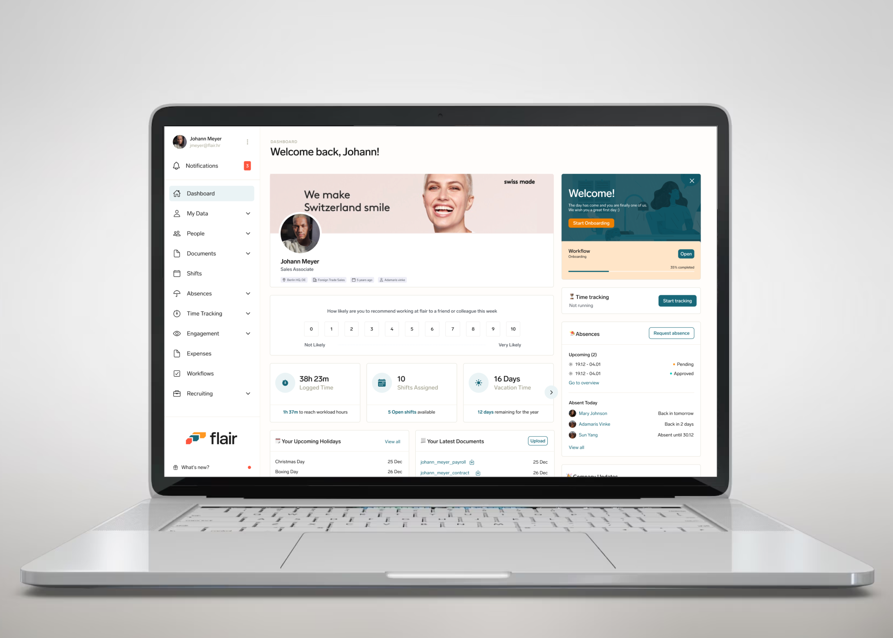
Simplified Dashboard Layout
My primary objective was to present a more simplified layout that would enable users to navigate and access critical information with ease. This redesign aimed to declutter the interface, improve visual clarity, and prioritize essential data.
By simplifying the homepage layout, we aimed to create a more intuitive and user-friendly environment, ensuring that users could quickly find the information they needed and make the most of the platform's features. This approach ultimately contributed to a more efficient and enjoyable user experience on the Baki dashboard homepage.
The redesigned Baki dashboard homepage in a more simplified layout
Showing a Clear Hierachy
Users want to easily access the most relevant insights for them. To address this, I focused on redesigning the homepage dashboard of our web app to present information in a clear hierarchy. The most critical data is now showcased prominently at the top, while less vital information is grouped together in a separate section below.
The initial section I revamped was the rewards banner. I made it more visually appealing and prominent to catch users' attention and encourage them to claim their rewards if available. Prior to the redesign, the rewards banner lacked visual appeal and failed to capture our users' attention. Following that, I enhanced the visibility of insights related to users' overall financial health, transactions, collateral, and debt. Additionally, I made it possible for users to take quick actions upon landing on the dashboard by providing easy access to deposit and withdrawal features right on the homepage. Users can also view a list of their recent transactions for added convenience.
The redesigned dashboard homepage presenting information in a clear hierarchy
Other Screens
I designed the layout to be flexible so users can easily navigate to the different sections of the web application depending on what information they want to see or what action they need to perform.
Other screens of the Baki app
Outcome
Baki made its debut on the Avalanche Fuji Testnet, we adopted early testers through the launch of a campaign on
Nodo, a renowned platform dedicated to bolstering blockchain enterprises across the African continent.
In 2 weeks, Baki got over 1000 test transactions on the platform. These transactions were initiated by a diverse group of crypto enthusiasts, as evidenced by the presence of 34 unique wallet addresses actively managing and transacting the Baki zUSD tokens on a daily basis.
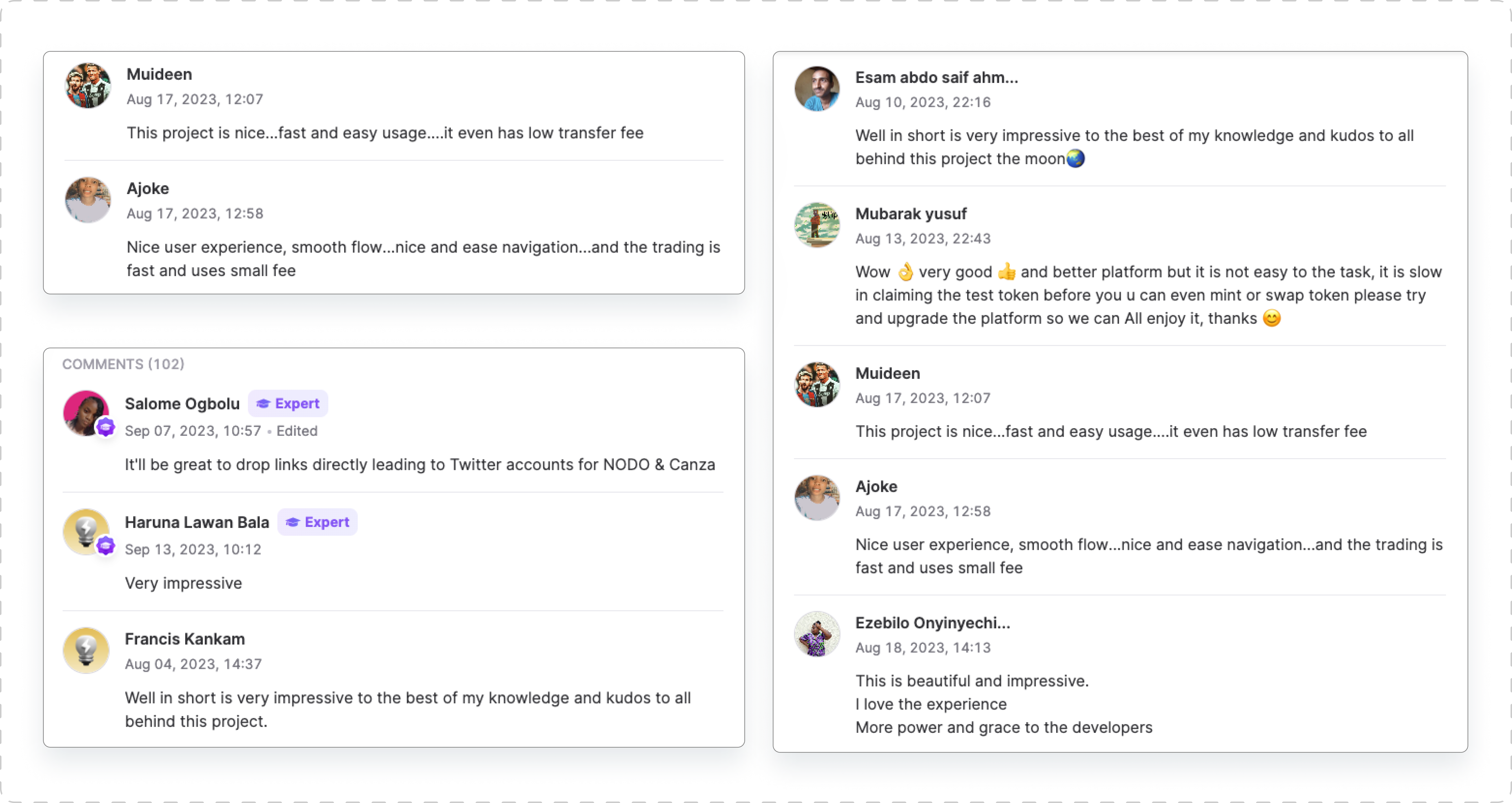
The Baki project experienced an organic uptick in our
Discord community, with membership numbers soaring by an impressive 30% within the same two-week period. Feedback was resoundingly positive, with great appraisal of the experience design as well as the smoothness of the transaction process.