The redesigned filtering experience for the "Payments for Posting" feature on Zentist's Remit AI
Information on this project is limited.
Zentist's Remit AI web app centralizes EOBs and ERA data from across 700+ insurance payers for faster payment posting and ease of reconciliation.
I had the opportunity to rework the filtering experience for our Remit AI web application. Remit AI leverages robotic process automation (RPA) and machine learning to automate otherwise tedious RCM tasks.
The Payments for Posting feature helps practices post insurance payments seamlessly by taking all the payment data coming from payers and clearing houses, adding it's own standardization layer to make the posting process as straightforward as possible.
I was the sole UX & Product designer for this project. My contribution was in Research, UX, Visual and Interaction Design.
Team
Kikelomo Blavo (Me) UX & Product Designer
Iryna Soloviova - Senior Product Manager
Artur Sianiuk - Software Engineer
Tools
Figma, Notion, Jira
Release Date
July 2023
The Problem
The current filtering process on the page was limiting for our users and had a number of issues
- Filters were too many and screen real estate is not well utilised
- Positioning of the filters was distracting for the user
- Users could not filter with multi-selection
- Applied Filters were not visible and/or easily detected
- Overall filtering process was generally confusing for our users
What we want to achieve
Our goal was to rework the current filtering system on the "payments for posting" page and designed a consistent and predictable experience with and expand functionality of filtering with the following considerations:
- Filters should be hidden/collapsible so it doesn't interfere with user's interaction with the page
- Combination Of Filters Is Supported
- Applied Filters Are Easily Detected
- Selected Options For Filtering Are Visible
- Manual Entry of at least 3 letters to search the required option
The current filtering process on the page was limiting for our users and had a number of issues. The filters were positioned in a way that was very distracting for the user and interfered with their work
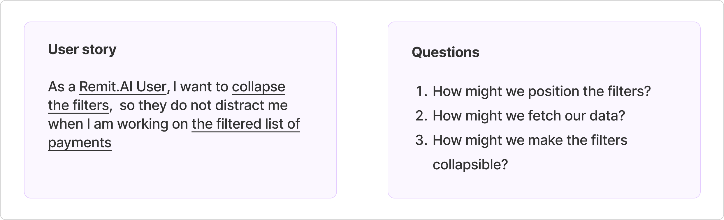
First Approach - Understanding User needs
Asides from ensuring that the filtering experience provided the desired outcome for our users, another important aspect to consider was to ensure that the filters were designed and positioned on the page in a way that did not interfere with any other task performed by our users but easily accessible. This requires reworking the whole filtering process for taking into consideration how it is positioned on the page, how user's see results.
Ideating the design - How might we position the filters?
Every function or pattern has its own industry standard and different ways to design. So I needed to start with our first question:
How might we position the filters? After doing some
research (find resource
here) and exploring different options, I came up with 3 different options of filtering positioning, highlighting which is considered as standard approach and which takes a more leading approach
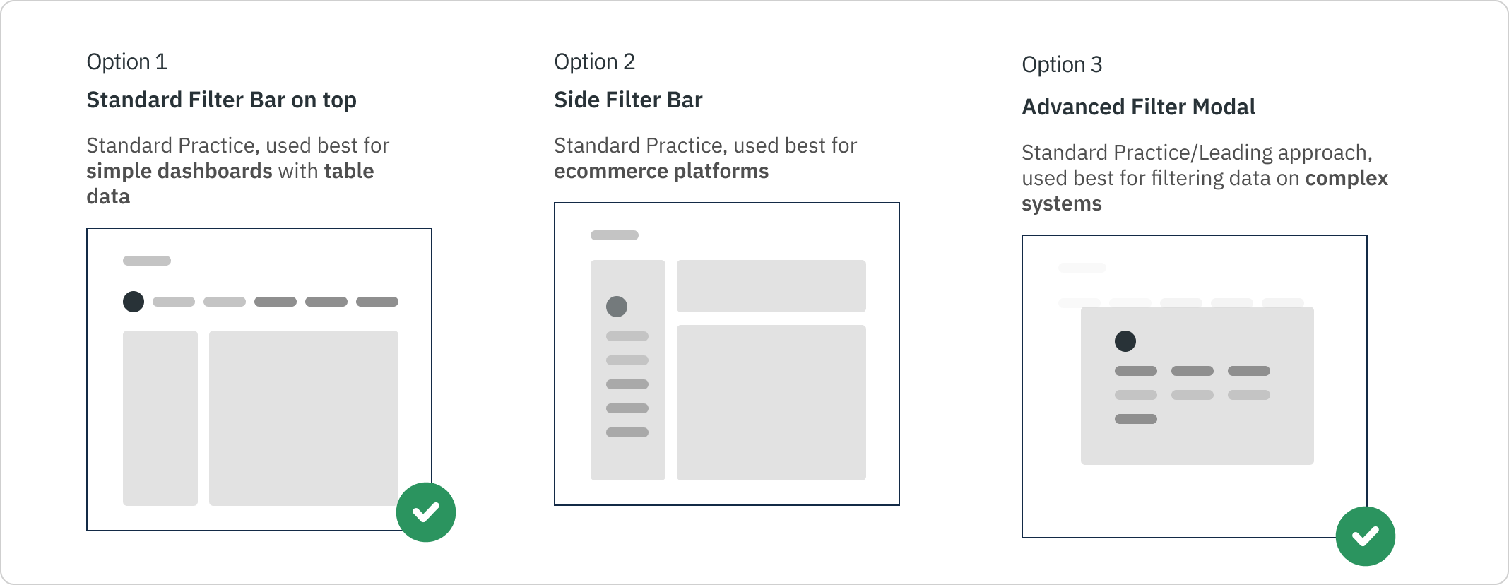
I wanted to create a filtering process that was simple, and easy to understanding and does not interfere with the main data of the screen. As indicated in the image above, and after discussions with stakeholders, we decided to go with a combination of both the standard filter bar at the top and the advanced filtering modal.
This is because the platform is heavily driven by lots of data and I also wanted to take into consideration the scalability of the platform and what potential features that may be added in the future that may affect the filtering process. This will also play an important part for the collapsible feature.
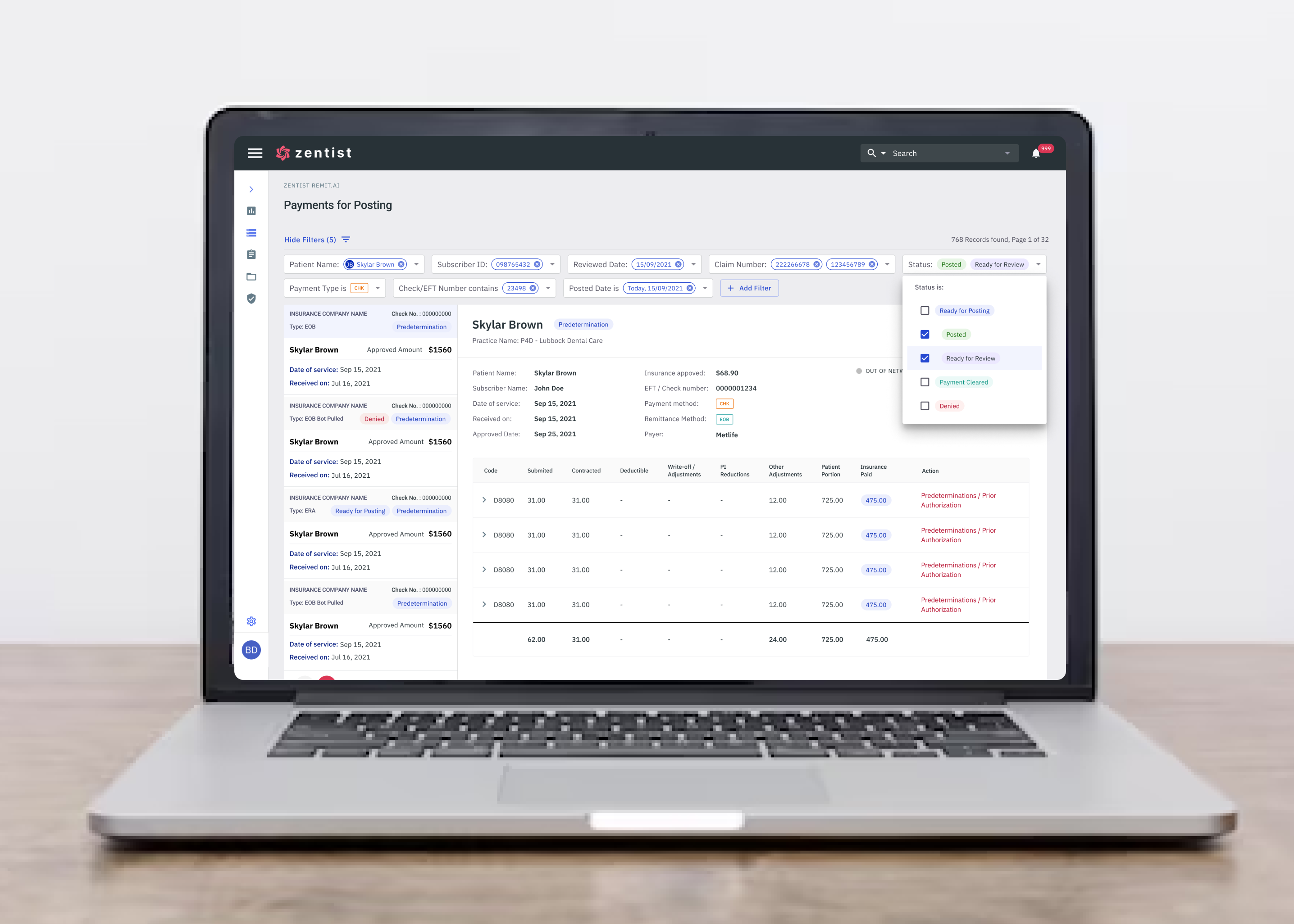
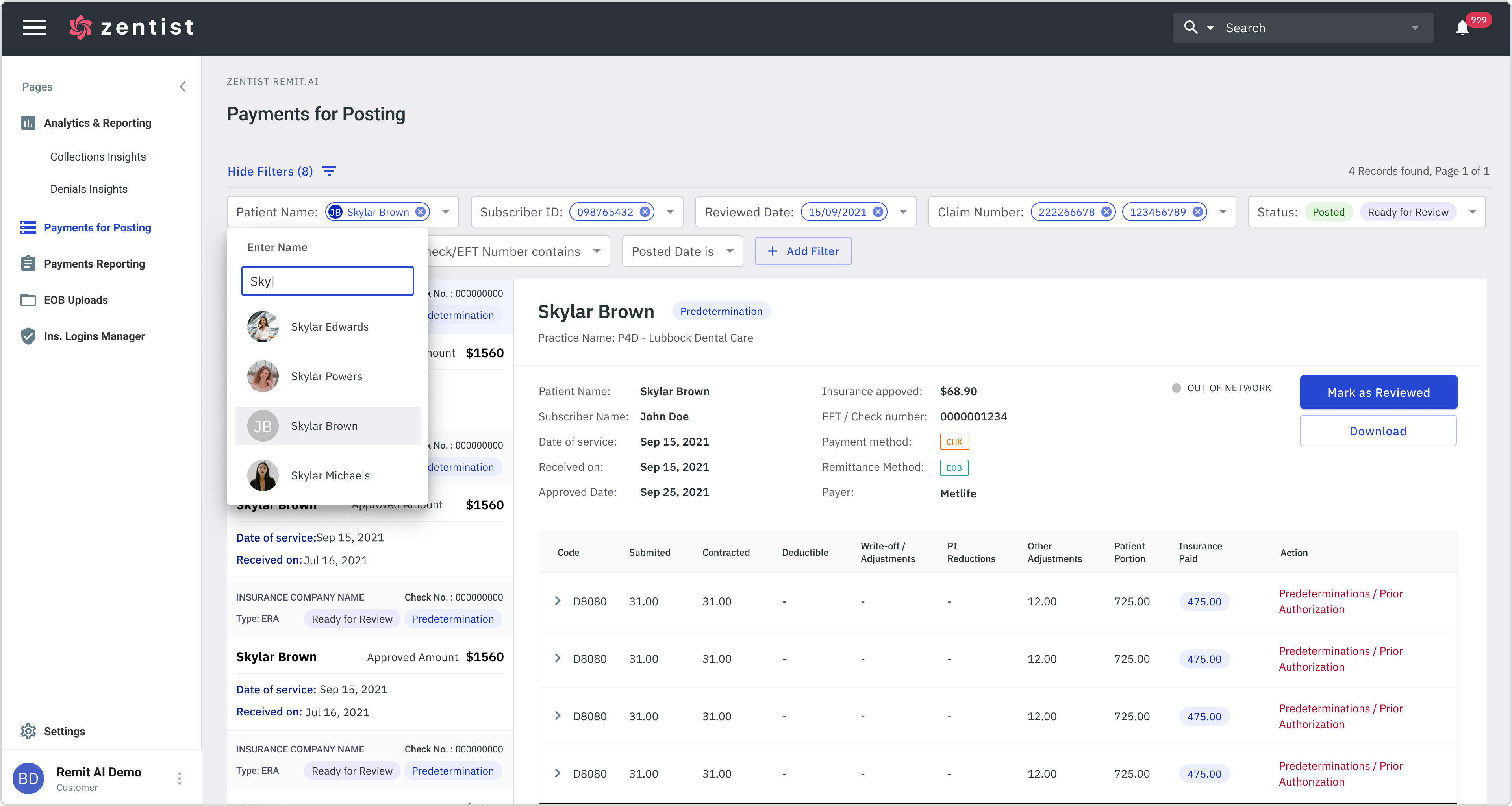
Depending on the user’s needs they can combine both the standard filtering and advanced filtering. This gives them more flexibility as well as more viewing options. The “Hide/Show Filter” CTA shows the number of filters selected and gives the user the option to hide the filters from view
Standard Filters
For our standard filters, while positioning the filters, I took the following into consideration to significantly enhance it's functionality and value for our users:
- Combination Of Filters Is Supported
- Selected Options For Filtering Are Visible
- Manual Entry of at least 3 letters to search a required option
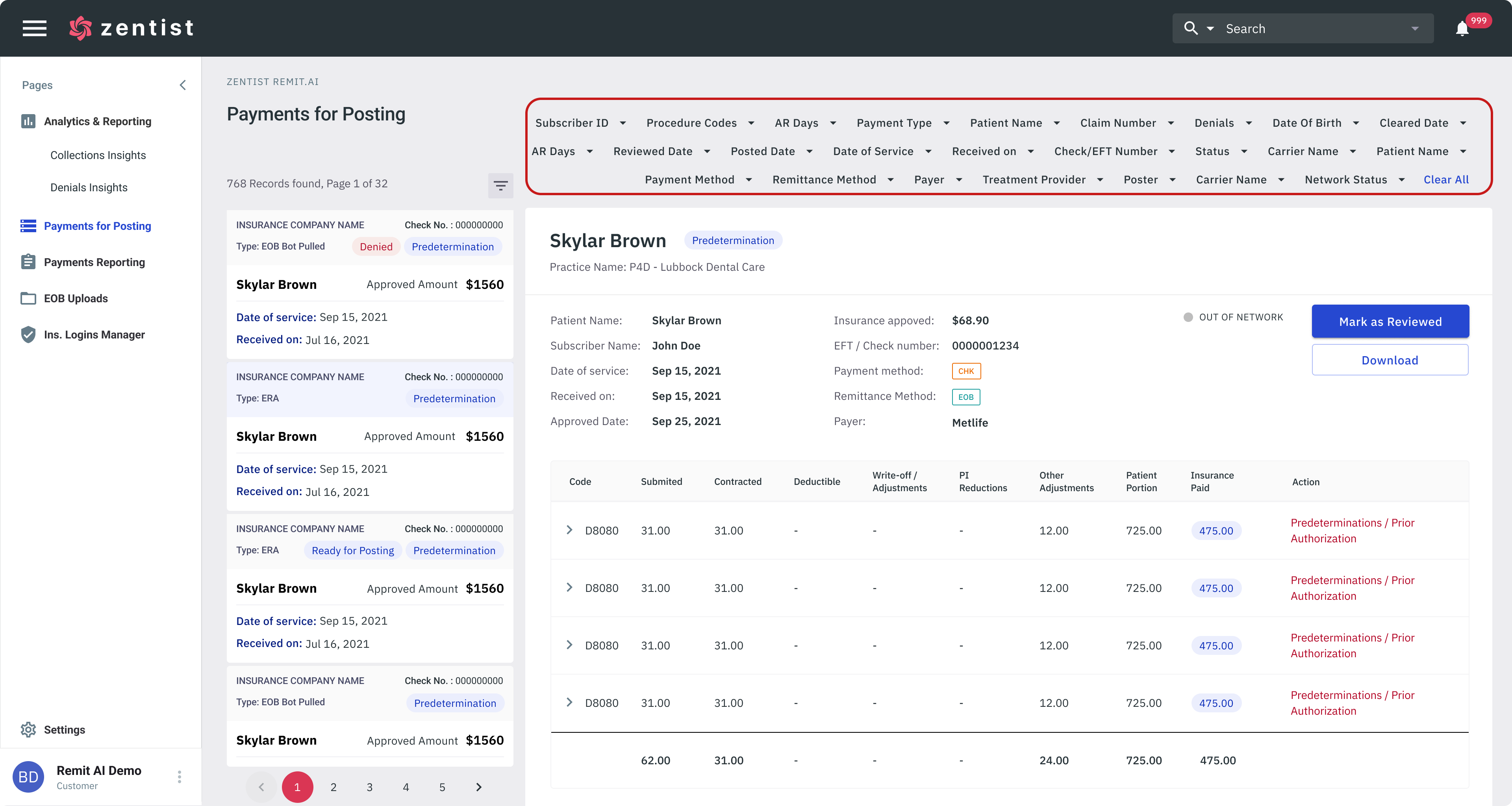
Advanced Filters
Our advanced Filters is triggered from the “Add Filter” button. Users can use advance filtering to trigger more specific options if they know exactly what they are looking for. This takes away the filtering process from the main screen and instead is done inside a pop up modal. This removes any interference or distraction from the main content on the page. After triggering a batch of filters, Users can collapse or expand the filters .
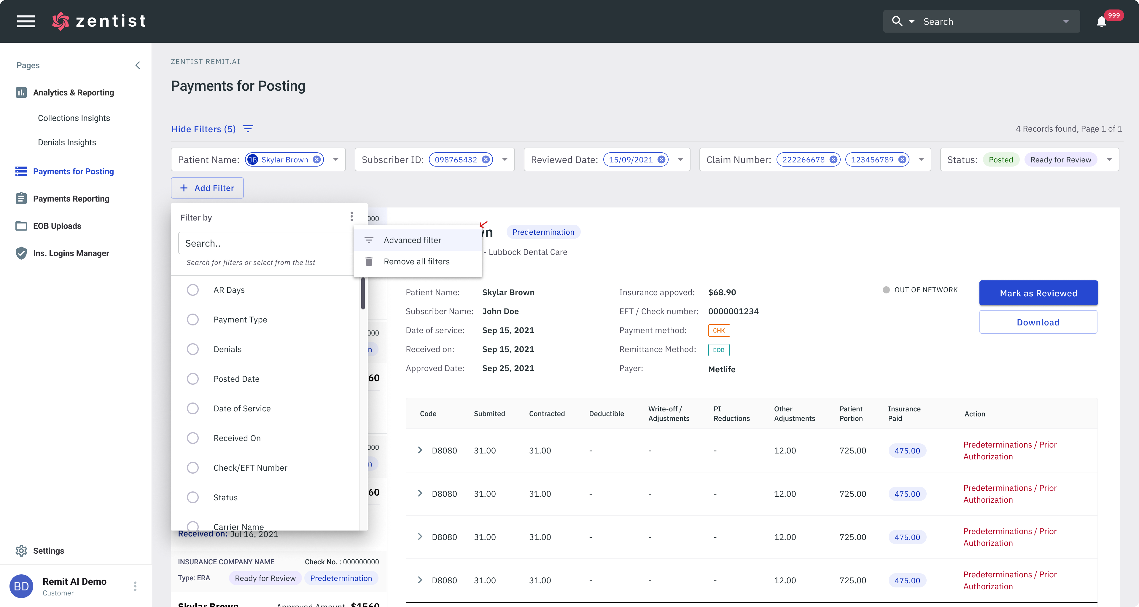
Users can use advance filtering to trigger more specific options if they know exactly what they are looking for.
Ideating the design - How might we fetch our Data?
Every function or pattern has its own industry standard and different ways to design. So the next step was to design how the it's functionality: How might we position the filters? After doing some research and exploring different options, I came up with 3 different options of fetching our data.

Live Filtering for Standard Filters
After a lot of consideration, I chose to use live filtering for our standard filters to help reduces time spent on the filtering process, this would work best for our standard filtering. Please click the image below to view high resolution prototype
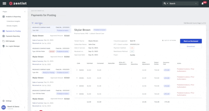
Using live filtering for our standard filters reduces time spent on the filtering process (Click Image to view prototype)
Batch Filtering for Advanced Filters
Using simple UX writing, I tried to make the advance filtering more understandable for the user by using simple language and (not formulas as most enterprise apps use). If the user chooses to use the advanced filtering options (with a modal), then they can filter in batches. Please click the image below to view high resolution prototype
Using batch filtering for our advanced filters reduces time spent on the filtering process (Click Image to view prototype)
Collapsible Feature
I wanted to create a filtering process that was simple, and easy to understanding and does not interfere with the main data of the screen. So the next step to consider was How might we make the filters collapsible?
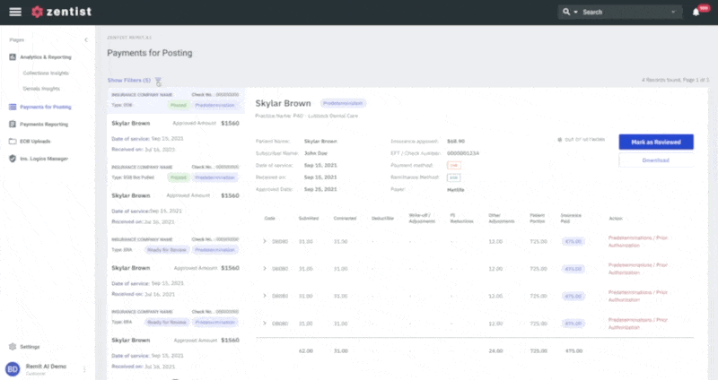
The “Hide/Show Filter” CTA shows the number of filters selected and gives the user the option to hide the filters from view just by simply clicking on it. This approach ensures that our collapsible feature encompasses and works well with both solutions

By simply clicking on the hide/show filters, users can collapse or expand to view filter options. This approach ensures that our collapsible feature encompasses and works well with both standard and advanced filtering solutions (Click Image to view prototype)
Outcome
To ensure good usability of the collapsible filters and making sure to keep all existing experience with the filters; the positioning, results, as well as allowing the users have access to the filters where especially important to consider. This gives them more flexibility, viewing options and allows the users to focus on the filtered list of results without being distracted by the filters.
Design and implementation were completed within the space of 2 months and we were able to test with a handful of our users to validate our solution. Overall feedback was generally positive and adoption was quick. It was clearly a much needed solution that help increase our client's engagement with the app. The Redesign was released in July 2023.

.png)